From the Output Tables menu, select Table 13-14 to output Table 13. Excel plots can also be produced.
Table 13 Excel plots correspond to Table 13.
Table 14 Excel plots correspond to Table 14, the pairwise report. Excel may be slow to plot this, and may not display the legends correctly. See below how to identify points.
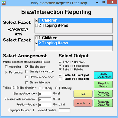
Bias reportable size and significance are the minimum absolute values to be reported. Only values more extreme are shown in the Tables. Typical significance sizes are 1.96 for 5% significance (double-sided) and 2.58 for 1% significance (double-sided).
For "Element number order", top facet is minor, bottom facet is major.
"Only report for facet: " - this is the facet number in the top Select Facet box
"element number:" - there is no number here, then all elements are reported. If there is an element number, then only this element of the selected facet is reported.
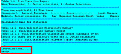
The bias/interaction terms are computed, and Excel is launched to plot them:
Warning! Plotted interactions pruned to first 250 on Excel plot
The number of series to be plotted has been pruned to fit into Excel limits.
When "Excel plots" is checked and Microsoft Excel is available, then Excel plots are produced of the numbers reported in Tables 13 14. The direction of the measures on the plots accords with the orientation of the facets (positive or negative). These plots can be edited using all the tools of Excel.
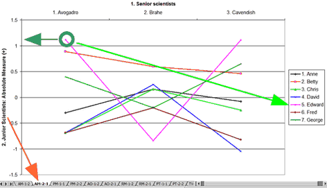
Here is plot AM-2-1. This shows the absolute measures (measures reported in Table 7 + bias/interaction measures reported in Table 13). The measures are for the elements of Facet 2, as perceived by the elements of Facet 1. The Green circle highlights the measure for Edward (facet 2, element 5) according to Avogadro (facet 1, element 1).
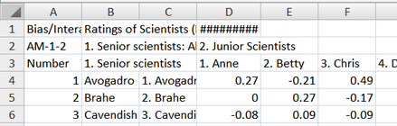
Table 13.4.1 Bias/Interaction Report (arranged by mN).
Bias/Interaction: 1. Senior scientists, 2. Junior Scientists (higher score = higher bias measure)
-----------------------------------------------------------------------------------------------------------
| Obsvd Exp. Obsvd Obs-Exp| Bias Model |Infit Outfit| Senior scientists Junior Scientis |
| Score Score Count Average| Size S.E. t | MnSq MnSq | Sq N Senior sc measr N Junior measr |
-----------------------------------------------------------------------------------------------------------
| 36 29.2 5 1.36| .69 .35 2.00 | .5 .5 | 13 1 Avogadro -.04 5 Edward .42 |
According to Table 13, when Avogadro rated Edward, the ratings were 1.36 higher than expected, from Avogadro's perspective, Edward was .69 logits more able than his overall measure. Edward's overall measure (at the extreme right) was .42 logits. So his measure from Avogadro's perspective was .42 + .69 = 1.11 logits, as indicated by the measure on the y-axis (heavy green arrow).
Each plot has a name like "AM-1-2". "AM" identifies the plot type. The first number, "1" is the facet number of the target facet. The second number "2" is the facet number of the context facet.
Worksheet Code |
Facets Table |
Contents |
AM |
13 |
Absolute Measures: the absolute bias/interaction measures (overall measures + bias) are shown for each target element. |
PM |
14 |
Paired Measures: the differences between the bias/interaction measures for each pair of target elements in a facet |
AO |
13 |
Average Observation for each target element |
RM |
13 |
Relative Measures: the bias/interaction measures relative to the overall measures for each target element |
PT |
14 |
Pairwise t: the t-statistic testing the hypothesis that there is no pairwise bias/interaction effect for each pair of target elements |
TV |
13 |
t oVerall: the t-statistic testing the hypothesis that there is no bias/interaction effect relative to its overall measure for each target element |
Worksheet |
the numbers that Excel is plotting - these can be edited as desired. |
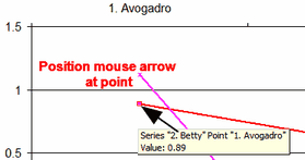
Position the mouse arrow over a point on the plot to see its details:
Excel Worksheet: This contains the plotted values. You can copy-and-paste for other uses.