Click on "Graphs" on the Menu bar:
1. Original. This is the Graph window implemented in Facets since 2002.
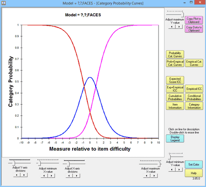
Click on Original, then the Graph window will display graphs looking like:
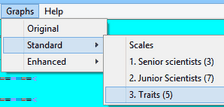
2. Standard. This uses the 32-bit (VB6) Winsteps graphing module.
Click on Standard, and a sub-menu appears::
On sub-menu: Scales - this displays a Graph window similar to the Original window but with more functions:
In analysis of Guilford.txt:
On sub-menu: 1. Child (75) - Facet number 1. Facet name: Child. Count of active elements in the facet: 75
On sub-menu: 2. Activity (25) - Facet number 2. Facet name: Activity. Count of active elements in the facet: 25
Click on your choice to display the model and empirical curves for each element of the facet.
Only elements with all observations on the same rating scale can be shown.
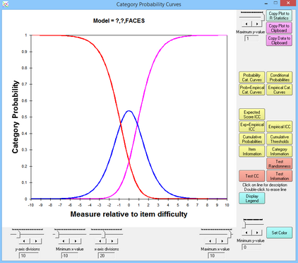
3. Enhanced. This uses the 64-bit (Xojo) Winsteps graphing module.
Click on Enhanced, and a sub-menu appears.This displays a Graph window similar to the Standard Graph window but with more functions:
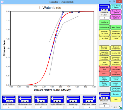
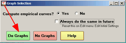
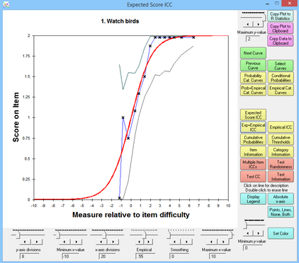
You may be asked if you want to compute the empirical curves, or only display the model curves. Check "Always do the same in future", and click "Yes" unless you have very large datasets. Click on "No" if you don't need to see the empirical curves. This can be reset in Edit Initial Settings.